Saturday, 8 May 2010
Thursday, 6 May 2010
Final Double Page Spread for Music Magazine

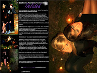
Above is my final Double Page Spread for the music magazine "Ambience" that I have created. I created my final Double Page Spread on Adobe Photoshop 7.0 using 4 of my previous edited images.
By analysing Double Page Spreads as part of my research, I gained valuable information and knew what I needed my own Double Page Spread to look like. I also completed a rough draft of my Double Page Spread before designing it, so I based my final idea around the original draft plan.
Photoshop allowed me to use a variety of tools when creating my final Double Page Spread. It allowed me to add and edit text, images and shapes. I gained experience using different tools on Photoshop by practising editing different images and therefore I applied my skills when designing my Double Page Spread. I set the page size to A3, as this is the size of 2 A4 pages and drew myself a guideline down the centre of the page so the page was split into 2.
I made sure that the page number on the bottom of the page was the same as stated in the Contents Page so that it could be linked by the reader. I created my interview with the music band on word before typing it up in Photoshop so I could make any necessary changes if needed. I decided to fill one page with one whole image. This way it could also double up as a poster and makes the article look more attractive.
I have included the same daisy image/stamp on every page as this will be used as an recognisable image.
Final Contents Page for Music Magazine

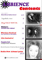
Above is my final contents page for the music magazine "Ambience" that I have created. I created my contents page on Adobe Photoshop 7.0 using 3 of my original edited images. I also included the new designed logo.
By analysing content pages as part of my research, I gained valuable information and knew what I needed my own contents page to look like. I also completed a rough draft of my contents page before designing it, so I based my final idea around the original draft plan.
Photoshop allowed me to use a variety of tools when creating my final contents page. It allowed me to add and edit text, images and shapes. I gained experience using different tools on Photoshop by practising editing different images and therefore I applied my skills when designing my front cover. I made sure that the contents page was understandable and that stories featured on the front cover, where included in the different page list.
I have included the same daisy image/stamp on every page as this will be used as an recognisable image.
Final Front Cover for Music Magazine

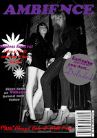
Above is my final front cover for the music magazine "Ambience" that I have created. I created my final front cover on Adobe Photoshop 7.0 using one of my previous edited images. However I had to change the logo as the original decided logo was too dark and was not visible on the dark background colours I used. I used the text from the original decided logo and kept the same font style to create the new used logo.
By analysing front covers as part of my research, I gained valuable information and knew what I needed my own front cover to look like. I also completed a rough draft of my front cover before designing it, so I based my final idea around the original draft plan.
Photoshop allowed me to use a variety of tools when creating my final front cover. It allowed me to add and edit text, images and shapes. I gained experience using different tools on Photoshop by practising editing different images and therefore I applied my skills when designing my front cover. I used the magic wand tool to select certain parts of the image and layer them over text so it looked like my main image overlapped other text and shapes.
Thursday, 22 April 2010
Designing my Music Magazine Logo


Firstly I experimented with different font styles, colours and images using InDesign. InDesign enabled me to use a variety of different fonts and effects and position the layout of the images and text in different ways.
I created 5 different logos and asked my friends and family which they preferred. I then selected the preferred logo(the half record) and using InDesign again, I placed the images and text in different ways.
Here you can see the 4 different logos I repositioned using the same image and text.
Wednesday, 21 April 2010
Risk assessment forms
Tuesday, 20 April 2010
Contributor Release Forms
Subscribe to:
Comments (Atom)


