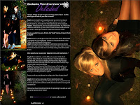
Above is my final Double Page Spread for the music magazine "Ambience" that I have created. I created my final Double Page Spread on Adobe Photoshop 7.0 using 4 of my previous edited images.
By analysing Double Page Spreads as part of my research, I gained valuable information and knew what I needed my own Double Page Spread to look like. I also completed a rough draft of my Double Page Spread before designing it, so I based my final idea around the original draft plan.
Photoshop allowed me to use a variety of tools when creating my final Double Page Spread. It allowed me to add and edit text, images and shapes. I gained experience using different tools on Photoshop by practising editing different images and therefore I applied my skills when designing my Double Page Spread. I set the page size to A3, as this is the size of 2 A4 pages and drew myself a guideline down the centre of the page so the page was split into 2.
I made sure that the page number on the bottom of the page was the same as stated in the Contents Page so that it could be linked by the reader. I created my interview with the music band on word before typing it up in Photoshop so I could make any necessary changes if needed. I decided to fill one page with one whole image. This way it could also double up as a poster and makes the article look more attractive.
I have included the same daisy image/stamp on every page as this will be used as an recognisable image.
No comments:
Post a Comment