Saturday 8 May 2010
Thursday 6 May 2010
Final Double Page Spread for Music Magazine
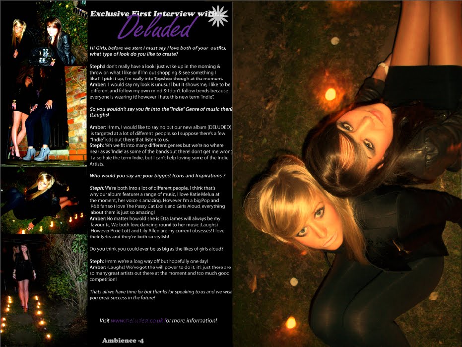
Above is my final Double Page Spread for the music magazine "Ambience" that I have created. I created my final Double Page Spread on Adobe Photoshop 7.0 using 4 of my previous edited images.
By analysing Double Page Spreads as part of my research, I gained valuable information and knew what I needed my own Double Page Spread to look like. I also completed a rough draft of my Double Page Spread before designing it, so I based my final idea around the original draft plan.
Photoshop allowed me to use a variety of tools when creating my final Double Page Spread. It allowed me to add and edit text, images and shapes. I gained experience using different tools on Photoshop by practising editing different images and therefore I applied my skills when designing my Double Page Spread. I set the page size to A3, as this is the size of 2 A4 pages and drew myself a guideline down the centre of the page so the page was split into 2.
I made sure that the page number on the bottom of the page was the same as stated in the Contents Page so that it could be linked by the reader. I created my interview with the music band on word before typing it up in Photoshop so I could make any necessary changes if needed. I decided to fill one page with one whole image. This way it could also double up as a poster and makes the article look more attractive.
I have included the same daisy image/stamp on every page as this will be used as an recognisable image.
Final Contents Page for Music Magazine

Above is my final contents page for the music magazine "Ambience" that I have created. I created my contents page on Adobe Photoshop 7.0 using 3 of my original edited images. I also included the new designed logo.
By analysing content pages as part of my research, I gained valuable information and knew what I needed my own contents page to look like. I also completed a rough draft of my contents page before designing it, so I based my final idea around the original draft plan.
Photoshop allowed me to use a variety of tools when creating my final contents page. It allowed me to add and edit text, images and shapes. I gained experience using different tools on Photoshop by practising editing different images and therefore I applied my skills when designing my front cover. I made sure that the contents page was understandable and that stories featured on the front cover, where included in the different page list.
I have included the same daisy image/stamp on every page as this will be used as an recognisable image.
Final Front Cover for Music Magazine

Above is my final front cover for the music magazine "Ambience" that I have created. I created my final front cover on Adobe Photoshop 7.0 using one of my previous edited images. However I had to change the logo as the original decided logo was too dark and was not visible on the dark background colours I used. I used the text from the original decided logo and kept the same font style to create the new used logo.
By analysing front covers as part of my research, I gained valuable information and knew what I needed my own front cover to look like. I also completed a rough draft of my front cover before designing it, so I based my final idea around the original draft plan.
Photoshop allowed me to use a variety of tools when creating my final front cover. It allowed me to add and edit text, images and shapes. I gained experience using different tools on Photoshop by practising editing different images and therefore I applied my skills when designing my front cover. I used the magic wand tool to select certain parts of the image and layer them over text so it looked like my main image overlapped other text and shapes.
Thursday 22 April 2010
Designing my Music Magazine Logo

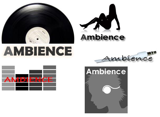
Firstly I experimented with different font styles, colours and images using InDesign. InDesign enabled me to use a variety of different fonts and effects and position the layout of the images and text in different ways.
I created 5 different logos and asked my friends and family which they preferred. I then selected the preferred logo(the half record) and using InDesign again, I placed the images and text in different ways.
Here you can see the 4 different logos I repositioned using the same image and text.
Wednesday 21 April 2010
Risk assessment forms


These risk assessment forms show that I analysed all aspects of safety before and during the photo shoot so that the contributors and my own safety was not affected.
Tuesday 20 April 2010
Contributor Release Forms


These contributor release forms show I had permission from both girls to use the images I took of them in my AS Media Coursework.
Tuesday 13 April 2010
Photoshop Practice with my images
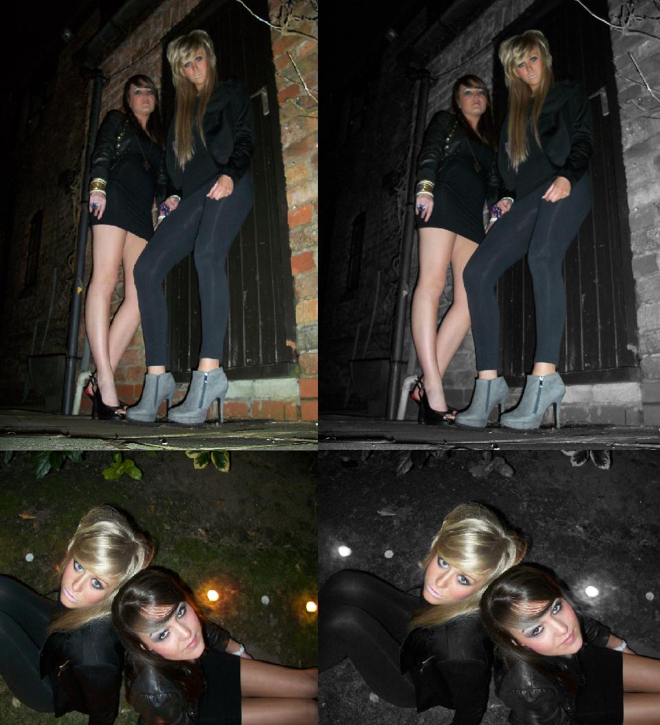
Above you can see before(2 of my original images from photo shoot) and after (the original images edited using Photoshop). I used photoshop to continue developing my editing skills. I practicded using the layering effect again, in which i created a new layer of the image which remains in colour and then converting the original background image to black and white. This makes my image appear to be coloured in sections and black and white in others.
Monday 15 March 2010
Original Images taken on Photo Shoot

Above are some of the original photographs of "Deluded" taken on the photo shoot. I planned to have 3 girls in the band, however one of the girls was ill on the night the photos where due to be took so I had to use only 2 of the girls, creating a duet. I will now pick at least 4 of my favourite images to use as my final images. I will edit my chosen images to remove red eye and add effects before adding them to my music magazine.
Plan of Photographs

Above is the check list I designed to make sure everything I needed was ready for the photo shoot.
I have decided to take the photos of the music band I am going to create in my back garden as it is quite a pretty environment and during night time when it is dark, it has a mysterious feel to it which I hope to show on the images. By adding tea lights/candles a subtle light will be added to the scene adding to the glamorous theme of the photographs. I have chose for the girls to wear dark clothing and dark make-up as this will add to the mysterious look I hope to achieve however they will still look glamorous as they will be wearing high heels and jewellery. Each member of the band will be wearing a purple accessory as this will be a recognisable image of the band. I have chose the colour purple as it is associated with nobility and class, showing the band have an essence of classiness.
Analysis of double page spread 2

I have chosen to analysis a double page spread on Will I Am featured in 'Vibe' magazine.
The first thing I noticed about this double page spread is how the artists name is referred to in the title. The main headline for this article "Will he won't he?" refers to the singer Will I am in the band Black Eyed Peas. Without reading the article the audience are automatically made aware that the article is about Will I Am, not just because of the association with his name in the title but also by the image. The image is of Black Eyed Peas and takes up the majority of the 2 pages. This image has been edited so that the 3 other band members have been faded and only Will I Am is kept in the original format to stand out. Will I Am is also standing in front of the 3 other band members suggesting he is a key part of the group or a key part of the article.
The article is descriptive text as it talks about the artist rather than an interview in which it would be the artist being questioned and him talking about himself. Certain key phrases in the article have been made bold or formatted to have a white font and a black background.
The black plain font is easily rad on top of the white background and the dark image also stands out on the light background
Over all this article looks smart and tidy and the only criticism I have is that some of the dark text is hard to read on top of the dull image. If I was to re-design this double page spread I would make that area of text a lighter or brighter colour.
Music Magazine Contents Page Analysis 2

I have chosen to analysis a second contents page of Vibe magazine to compare it with the first Vibe Magazine contents page i analysised it with.
The masthead has been positioned exactly the same as on the other contents page, this shows that the magazine follows a house style throughout different issues.
However the images are arranged completely different. On the first contents page i analysised I explained how there was only one image which took over most of the page whereas on this contents page there are several images which have been edited to add an old style photo effect, the oringinal square outline of the image has also been kept where as on the other contents page the womans body was the outline of the image.
Another similar feature of both contents pages of the different issues is the different styles of font, showing that all the text is also kept in a similar house style throught different issues. The background is plain white, different to the faded colour effect on the other issue. The black text stands out on the white background and is positioned in the centre of the page unlike the other issue where the text is aligned right.
The name of the magazine is displayed differently on this issue as its full title is displayed on the bottom of the page, unlike the other issue where only the first letter (V) is shown.
Saturday 13 March 2010
Analysis of music magazine front cover 2

Friday 12 March 2010
Music Magazine Contents Page Analysis

I have chosen to analysis a contents page for VIBE magazine.
The first thing that strikes me about this page is the way the masthead lettering has been positioned and the large image. The masthead is positioned in quite an unusual way but this has a positive effect as it makes the reader notice it. The image overlaps the corner of the masthead making the image stand out more. The image is of an attractive woman with an admirable figure and as the image is large and takes up most of the page it catches the readers attention straight away. Just by looking at this image you can see the magazine is based around R&B as the woman in the image has a similar appearance and figure to a woman in the R&B industry.
A lot of different styles of font have been used on the text, this is because there is quite a bit of information and by using a variety of fonts it prevents the reader from loosing focus and becoming bored.
The background has a light faded effect making the dark masthead and text stand out. The colours in the background also match those of which are on the outfit in the photograph, making the page look more attractive and sophisticated. On top of the faded background is a large 'V' this shows the name of the magazine (Vibe) therefore the contents page can easily be recognised as belonging to 'Vibe'.
Rough Drafts of Music Magazine

FRONT COVER^
This is my first rough draft of my music magazine front cover. I have decided to use this image as the final image on the front cover as the music band are central and therefore the main focus of this image. By having this central image I can add text down either side of the front cover. I will be editing this image and playing around with it to see which style fits best. I have used a variety of colours on this draft, however on my final music magazine I will only be using 1-3 colours so that the front cover doesn't look to crazy. This as a simple test for me, to see which colours work best on top of the black and white image. The masthead will be large and in the top corner of the front cover as this will be the magazine name and will stand out to the reader. The headline and sell line will be placed over the image so that the audience know the image is related to this. The magazine will include the date and issue number and a bar code as every magazine must feature these.

Contents Page-Design One.^
This is my first rough draft of my contents page. The main text box which display the page names and numbers will be split into 2 columns, this allows more space between the information and it will be easily read. I have not decided a colour theme or font yet as I want to edit my photographs and see what colours match best with the images.
I have kept this idea very plain as I think a contents page must not have too much information or too many images on as the reader must be able to read and understand the page names and numbers.

Contents Page-Design 2.^
This is my second rough draft of my contents page. The main text box which displays the page names and numbers will be stretched to almost the full length of the page, this allows more space for more information to fit into. I have also kept this idea very plain for the same reason as my first design. After finishing and editing my images I can decide a background colour or effect and can then decide how I will position the layout of my font.

Double Page Spread.^
This is my rough draft for the Double Page Spread. The main article takes up most of the 2 pages as this is the main feature of the double page spread. I have included one large image and 4 smaller images. I have decided that the background will either be black or white and the text will either be grey or purple. I will make these final decisions on my final double page spread so I can see what works best. I plan to add a faded effect to the edges of all the images so that they fade into the background smoothly. The page number and magazine name will be stated at the bottom of each page so that the audience can relate to the magazine and back to the contents page.
Thursday 11 March 2010
Photoshop


Above is a screen shot of an example of my work on photoshop, I have explained how i have formatted pictures to make them appear part colour and part black and white. This tool will be useful as I can use this on my photographs that I take for my front of the music magazine. I have also included some of the original photos I edited and the finsihed edited photos.
Images for College Magazine Front Cover

Above are some medium close up images I took of students to go on the front cover of my college magazine. As my photographs will be used for the specialist science college 'Deyes High' I tried to get some images of the students which would show the science award aspect.
I chose the image of the student participating in a practical science experiment as I feel this represents the specialist science award the most. This is shown as he is wearing a lab jacket, safety goggles and is holding chemicals in a test tube.
After choosing my image I upload it www. picnik. com and added a blured effect, this allowed the edge of the image to appear softer and blend in more once on the college maagzine.
You can see my final edited image on the front cover of the college magazine above.
Friday 19 February 2010
Inspirations
Mood Board
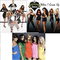
 I created a mood board to develop and inspire any design concepts I had. The mood board I created demonstrates similar ideas to which i hope to achieve in my music magazine. I considered and used anything which is inspired or linked to my original idea. My original idea was to create an R&B Girl Band, but after looking at many music artists i realised that not many R&B Bands are white and the girls i will be using to photograph for my band are all White. I then started to look at other girl bands in the pop and indie genre. I looked at glamorous clothing and accessories hence the:
- HIGH HEELS
- DRESSES
- MAKE-UP
- GLAM
- SEXY
- PARTY
Tuesday 9 February 2010
Analysis of double page spread

Monday 8 February 2010
Analysis of music magazine front cover

Tuesday 2 February 2010
Design of my College Leaflet Front Cover

I will use a more advanced computer design program to complete my final front cover and it will look similar to this however it will be completly finished.
Thursday 28 January 2010
Music Magazine Research Questionnaire
Thanks :)
Existing college magazines & mock ups of my design
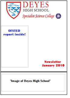
Today We looked at the Deyes High Newsletter. We decided that it was plain and boring. The reasons for this are that :

- It has one colour.
- There are not many images.
- The logo is faded.
- There is no shape to the layout.
- There is no Masthead.
- There is no variation for different editions as it follows a house style.
- The school badge is the main image.
Because of the above reasons we decided that this design was more of an information booklet than a magazine and its main purpose was to get the information across to the readers. As it is a school printing the leaflet, they will want to reduce printing costs and therefore print on a basic plain paper with black & white images.
We then re-designed the leaflet to suit its audience more appropriately. Here is my new design template. I will also use this as a template for my final college magazine.
I have kept the original Logo and header for the college newsletter as this must be the same on every issue.
One large medium close up image will be used as this is a coursework requirement. I will use this medium close up image to fill the background so that it is clearly visible. I will also include the traditional image of the College/School.
Any text will be blue or red as these are the colours featured in the School/College logo and therefore when placed along with the logo onto the leaflet, will look smart. Any text will be overlayed over the top of the background image, this is so that it is visible and easily read.
Tuesday 19 January 2010
Brief Description of Coursework- first blog
I will complete the first stage of my coursework(Research & Planning) by doing the following:
- Choose my Genre
- Product Research (x2 magazines)
- Questionnaire for target audience to complete
- Analyse a college magazine
- Front Covers (x2)
- Contents (x2)
- Double Page (x2)
- College Magazine Front- Image must be a 'Medium Close Up'
- Mood Board
- Mock up of magazines